Crafting a fluid, content-centric reading experience for the global launch of Google Play.
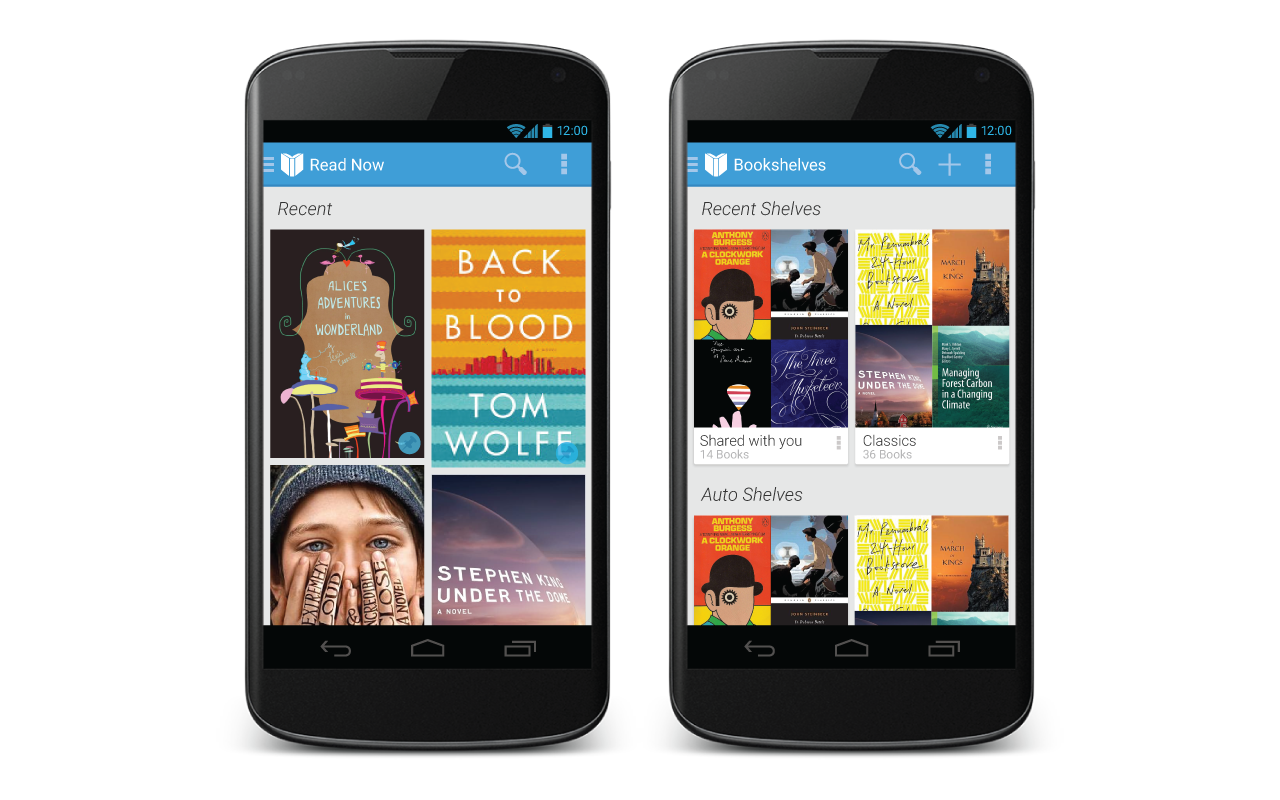
Google Play Books and Magazines
Google Play launched in 2012 as a unified digital ecosystem. It successfully consolidated the Android Market with Google’s fragmented media apps into a single, cohesive storefront for apps, music, movies, and literature.
My Role
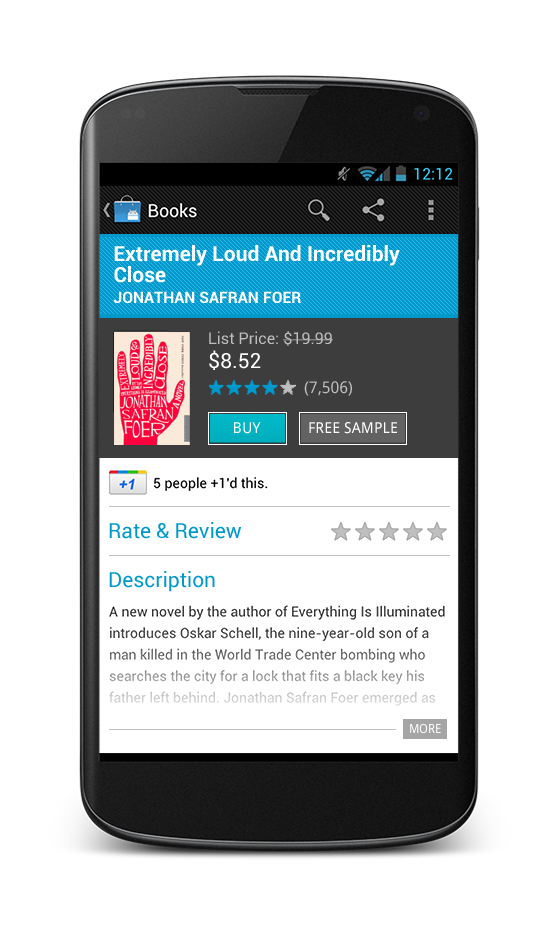
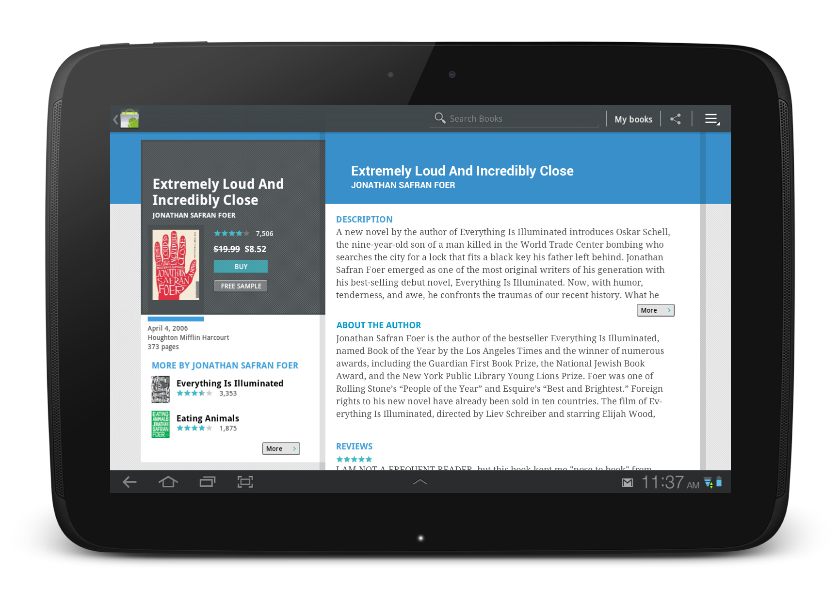
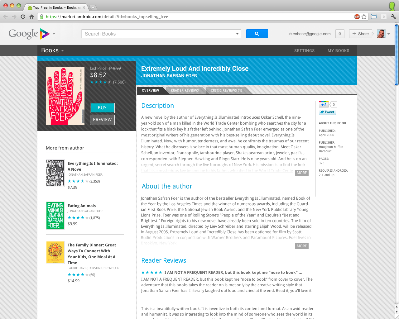
As the UX Lead for Books and Magazines, I directed the end-to-end experience—from discovery and purchase to cross-platform sharing—on Web, Android, and iOS. Working within the core Android Design Team, I collaborated with 10 designers and 2 researchers to define the visual and interaction language for the global launch of the Google Play brand.
Key Responsibilities: Cross-platform UX strategy, interaction choreography, brand integration, and design critique leadership.
The Challenge: Unifying a Fragmented Ecosystem
At the time of development, Google faced a multi-front battle for digital media dominance:
Market Dominance: Apple’s vertically integrated hardware/software ecosystem and Amazon’s Kindle platform held a firm grip on the eBook market.
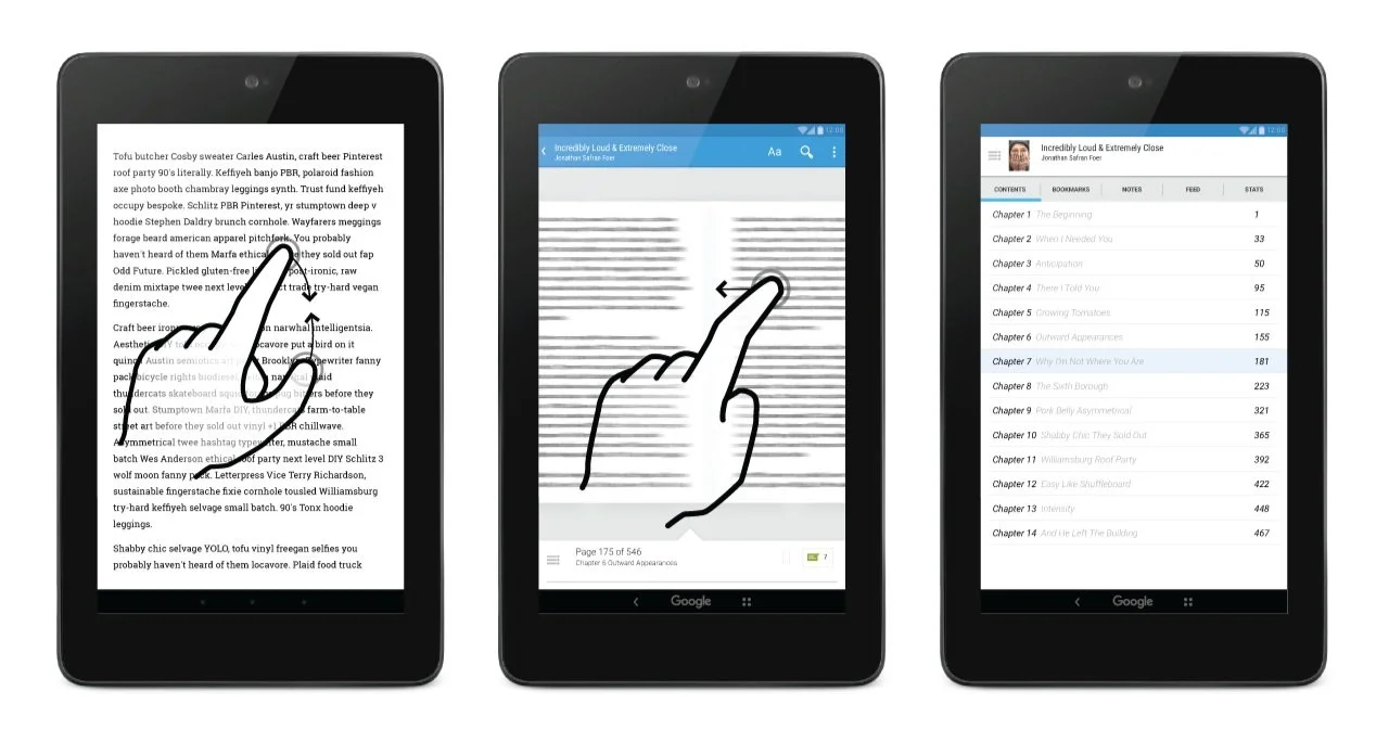
A “Content-Second” UI: Existing reading apps felt mechanical. Transitions were jarring, and the interface often overshadowed the content, failing to leverage the natural gestures (swiping/pinching) that mobile users expected.
Brand Friction: The Android Market and the pre-installed media apps (Books, Music) operated under disparate identities, creating a disjointed experience for the user.
The Approach: Collaboration at Scale
1. Cross-Functional Workshops
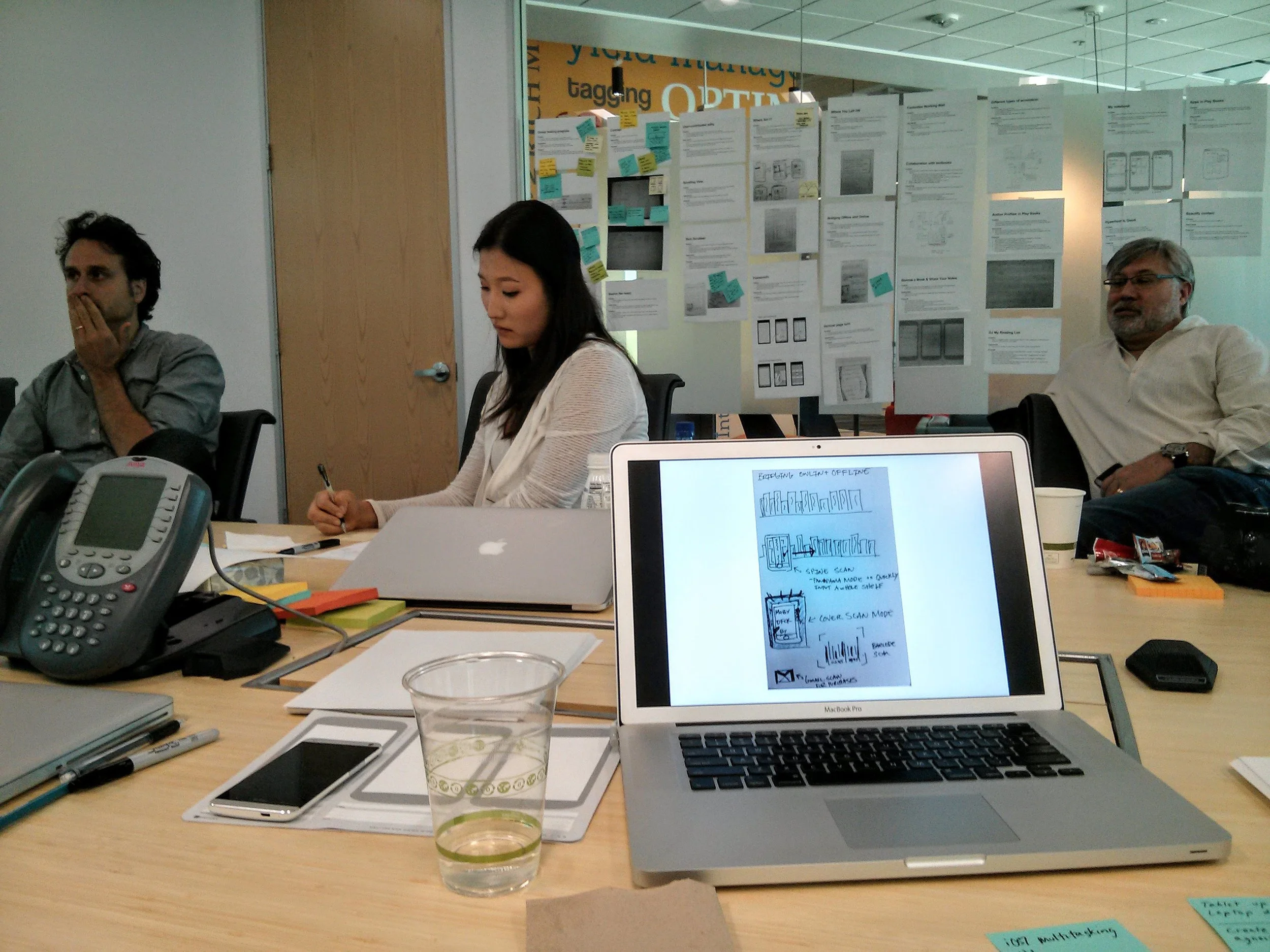
I facilitated design sprints with engineers, product managers, and the Android Design Team. We moved quickly from high-level brainstorming to prioritized feature sets, ensuring that Books would be a flagship pillar of the new Google Play identity.
2. Interaction Choreography & Prototyping
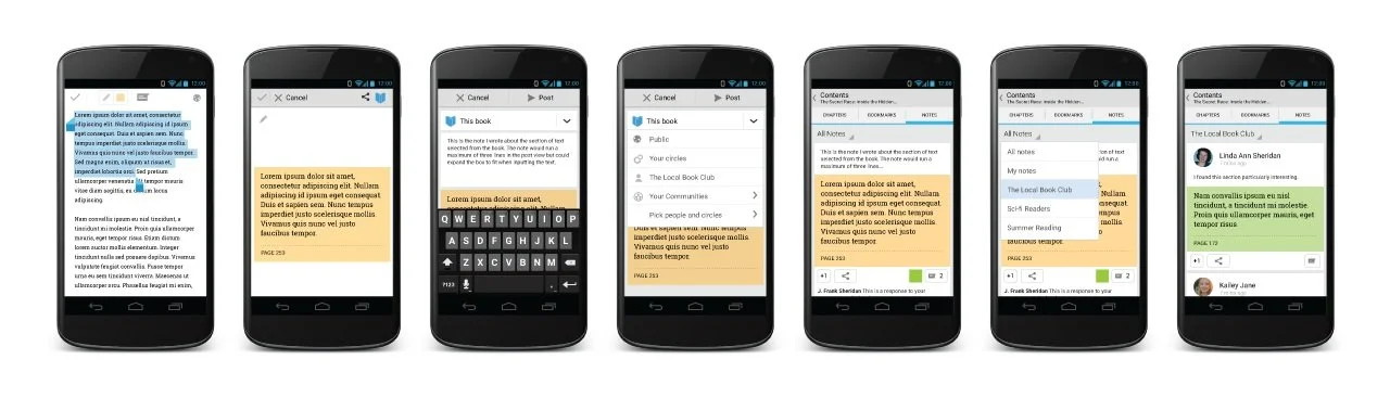
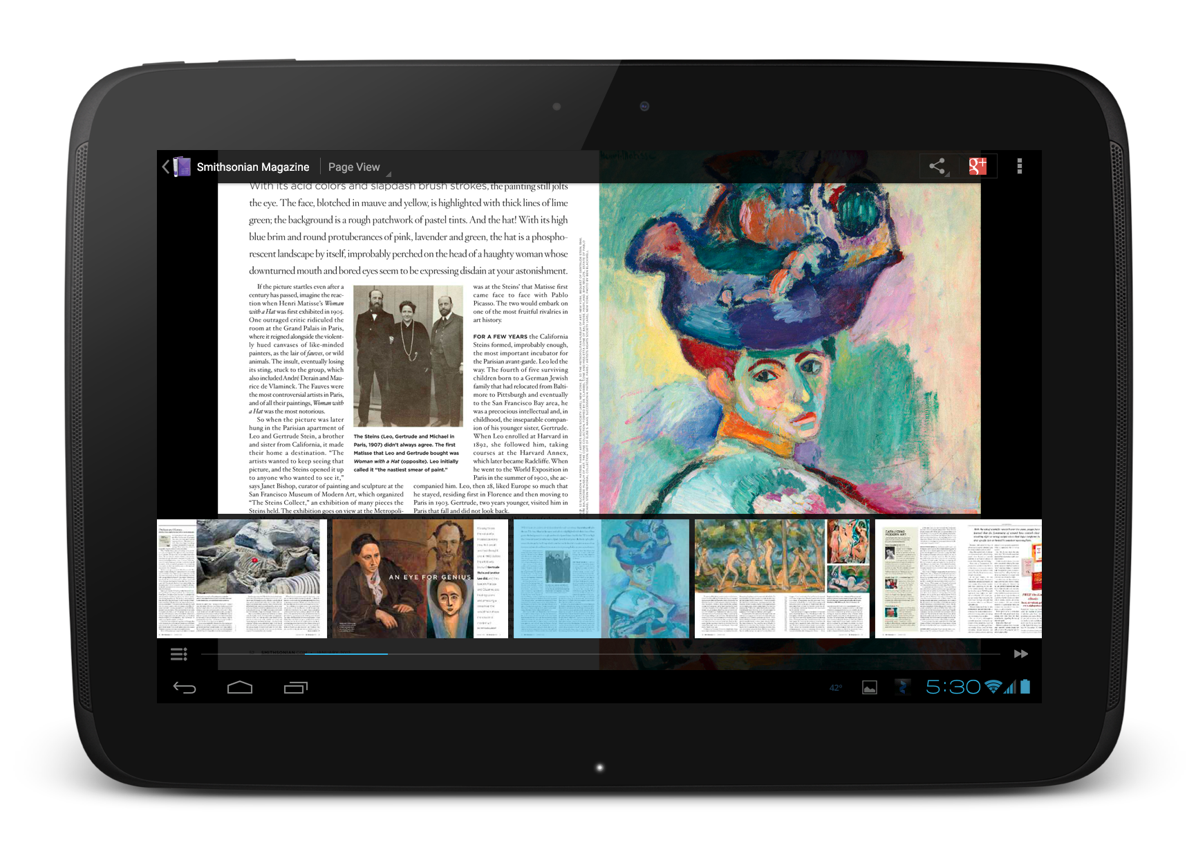
Using Adobe Illustrator and Keynote, I built high-fidelity prototypes focused on the choreography of the app. My goal was to move beyond static screens to create fluid, gesture-based transitions that made digital reading feel tactile and immersive across phones, tablets, and the web.
3. The Studio Wall Culture
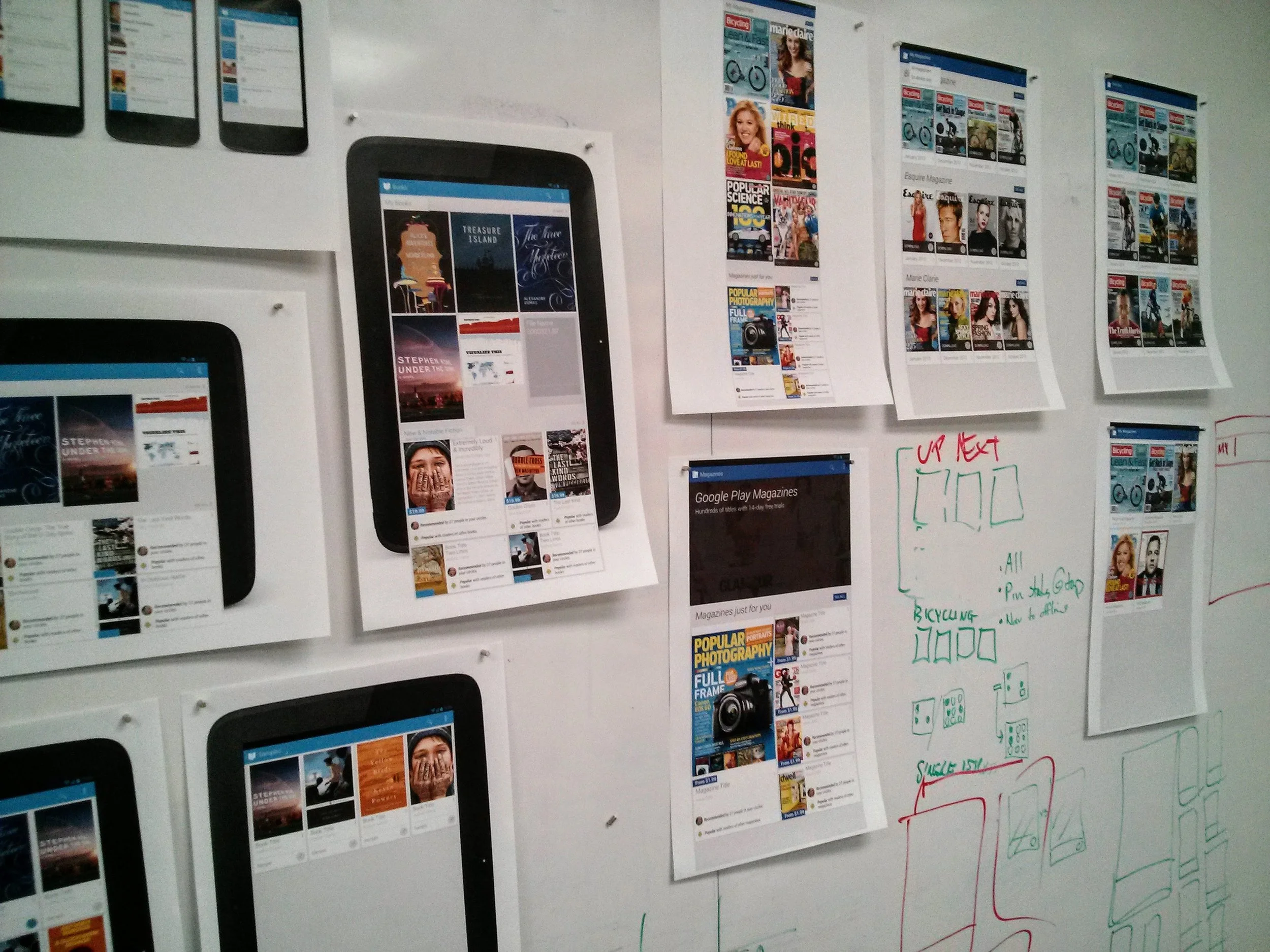
To ensure consistency across the wider Google Play suite, I led a rigorous critique process. By physicalizing the work—printing and pinning designs to the studio walls—I fostered an environment of transparent, frequent feedback that aligned our team of 10+ designers.
The Outcome: A Global Launch & Market Growth
My work helped transform Google’s fragmented media offerings into a premiere, cohesive brand.
Brand Cohesion: Successfully integrated Books and Magazines into the unified Google Play design system.
Competitive Differentiation: Delivered an elegant reading experience that prioritized content over UI, effectively challenging established competitors.
Business Impact: Following the redesign and rebrand, the Books app saw a substantial increase in downloads, user ratings, and total revenue.
The Retrospective: Designing for Change
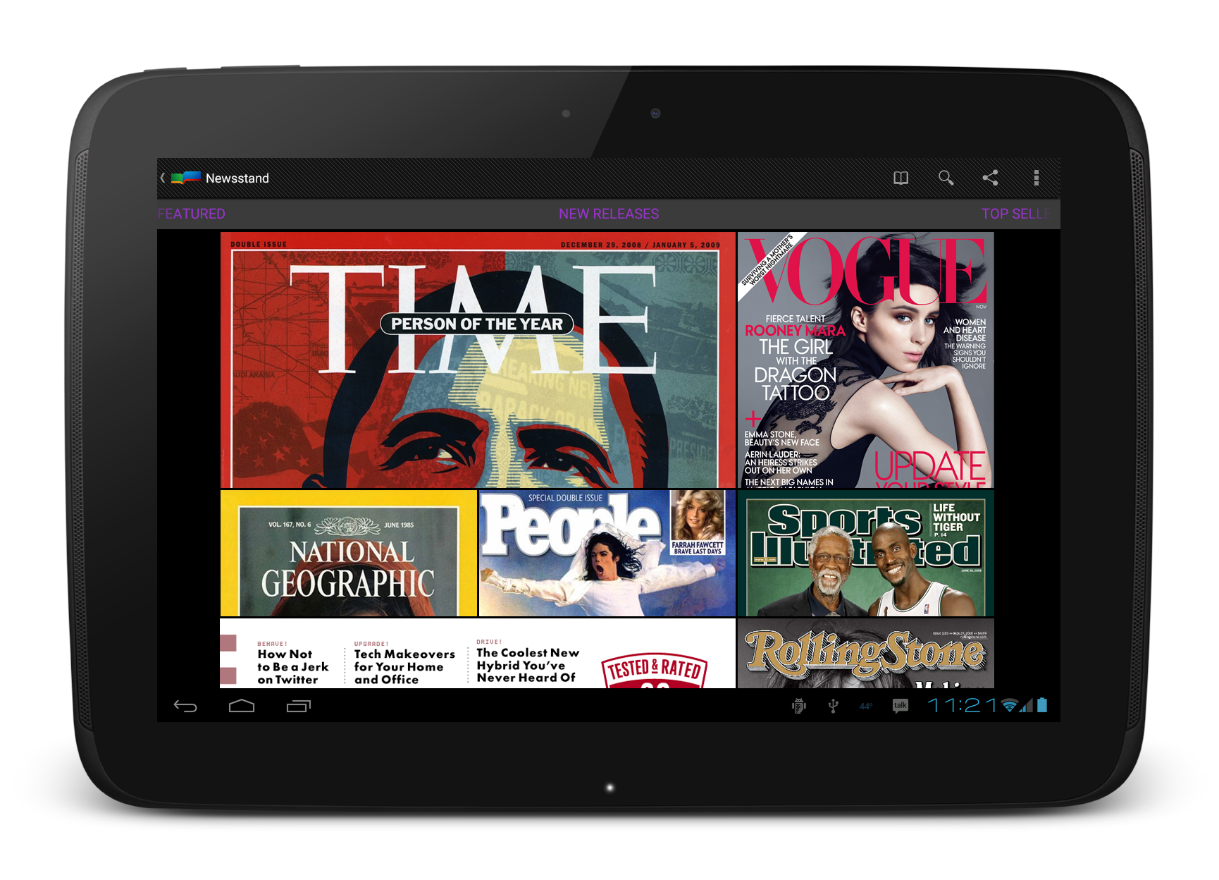
This project was a masterclass in designing within constraints—specifically the rigid formatting requirements of global publishers. It also reinforced the importance of agile architecture: the Magazines experience I designed was so effectively structured that it was successfully folded into Google Newsstand just one year later.